A large catalogue is a good problem to have, until shoppers cannot find anything in it. On a Shopify store with hundreds of products, navigation and collections do most of the selling: they decide whether a visitor reaches the right product in a few taps or gives up.
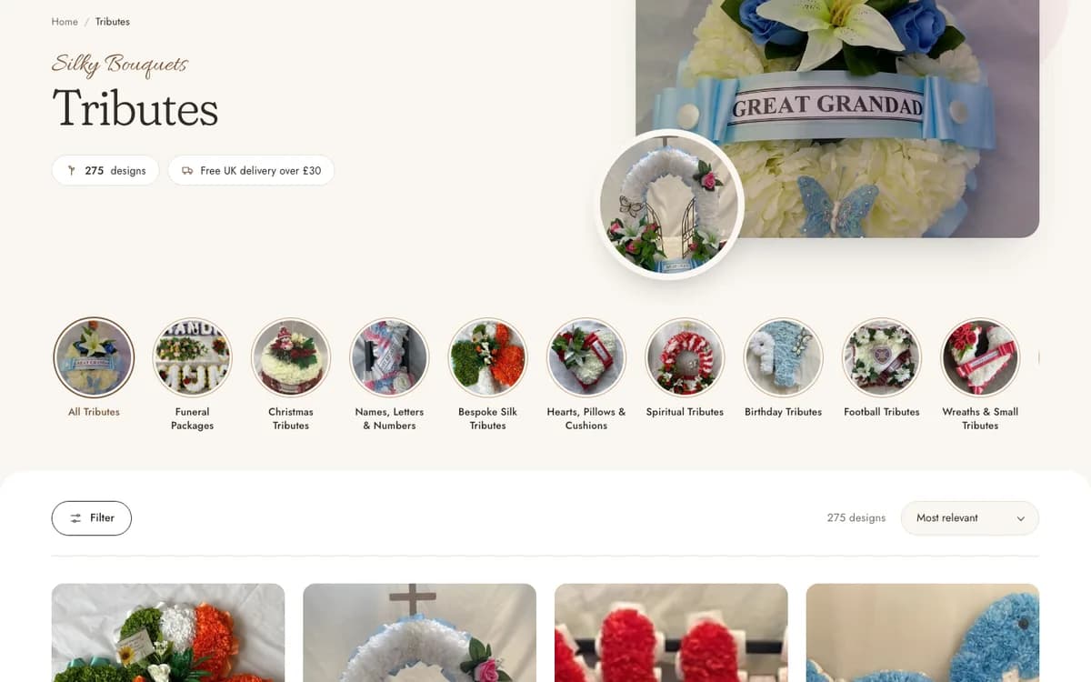
The Tributes collection on the Silky Bouquets store holds 275 designs. This guide uses it as an example of how to keep a big range easy to use.
Start with how customers think
Internal categories rarely match the way shoppers look. Build the top level around intent: the occasion, the recipient or the problem being solved. Silky Bouquets uses six top-level groups (Tributes, Christmas, Grave Pots, Weddings, Home & Gift and Fresh Flowers), each of which a visitor can recognise instantly.
- Keep top-level menu items to about five to eight.
- Use words customers use, not internal product codes.
- Put the most-wanted categories first.
- Avoid overlapping categories where a product could belong to several.
Use sub-collections to break a big range down
A single collection of 275 products is too long to scroll. Split it into sub-collections that answer a clearer question: what kind of tribute is this? Wreaths and posies, hearts and cushions, names and letters, coffin sprays, gates and crosses, and family packages each give the shopper a smaller, more focused list.
A simple structure for large catalogues
- 1Top level
A handful of intent-based groups in the main menu.
- 2Sub-collections
Smaller lists in a dropdown or mega menu.
- 3Collection page
A heading, count and visual shortcuts to related types.
- 4Filters and sorting
Tools to narrow by price, availability or type.
- 5Product cards
Clear photo, name, price and one obvious action.
Make collection pages do more than list
A good collection page orients the shopper. Show the number of designs, a note about delivery, and a row of circular category shortcuts so they can jump sideways without going back to the menu. Add a short line of help for people who cannot find what they want, such as a phone number and an invitation to ask for a custom piece.
Show starting prices on category cards
When people browse categories, a "from" price tells them quickly whether a category is in range. On the Silky Bouquets homepage every category card, from wreaths to family packages, carries a starting price. It saves clicks and builds trust.
Do not forget mobile
On a phone a mega menu becomes a stacked list, and sideways category circles replace wide navigation. Check that the menu opens easily, that the basket and search stay within reach, and that filters do not cover the whole screen. A large catalogue that works only on a desktop loses most of its visitors.
Connect navigation to search
Clean collections help search engines as well as shoppers. Each collection is a page that can rank for a specific search, with a clear title, a short introduction and descriptive product names. The wider picture is in SEO basics for a business website.
Frequently asked questions
How many collections should a Shopify store have?
As many as it takes to keep each list manageable, but no more. If shoppers need three taps to see a product, simplify; if a collection holds hundreds of items, split it.
Should products appear in more than one collection?
Yes, when it helps shoppers, for example a Christmas tribute that also sits within Tributes. Shopify collections can be automatic or manual, so one product can be listed in several places without duplicating it.
Is a mega menu worth it?
For a large range, yes, provided it stays tidy. For a small shop, a simple menu is better. It should reduce effort, not add choices.
Planning a larger Shopify store?
Menus, collections and product pages are part of every store I build and redesign, as described in the Shopify development packages. If your catalogue has outgrown its structure, get in touch. You can also read how a custom store was moved to Shopify in the migration guide.