You can send plenty of visitors to a Shopify store and still sell little if the product page does not answer their doubts. A shopper cannot hold the product, so the page has to do that work: show it clearly, explain it honestly and make buying feel safe.
This checklist comes from looking closely at how real stores handle the product page. I use real Shopify stores from the Work section as examples, so you can see each idea in practice rather than just read about it.
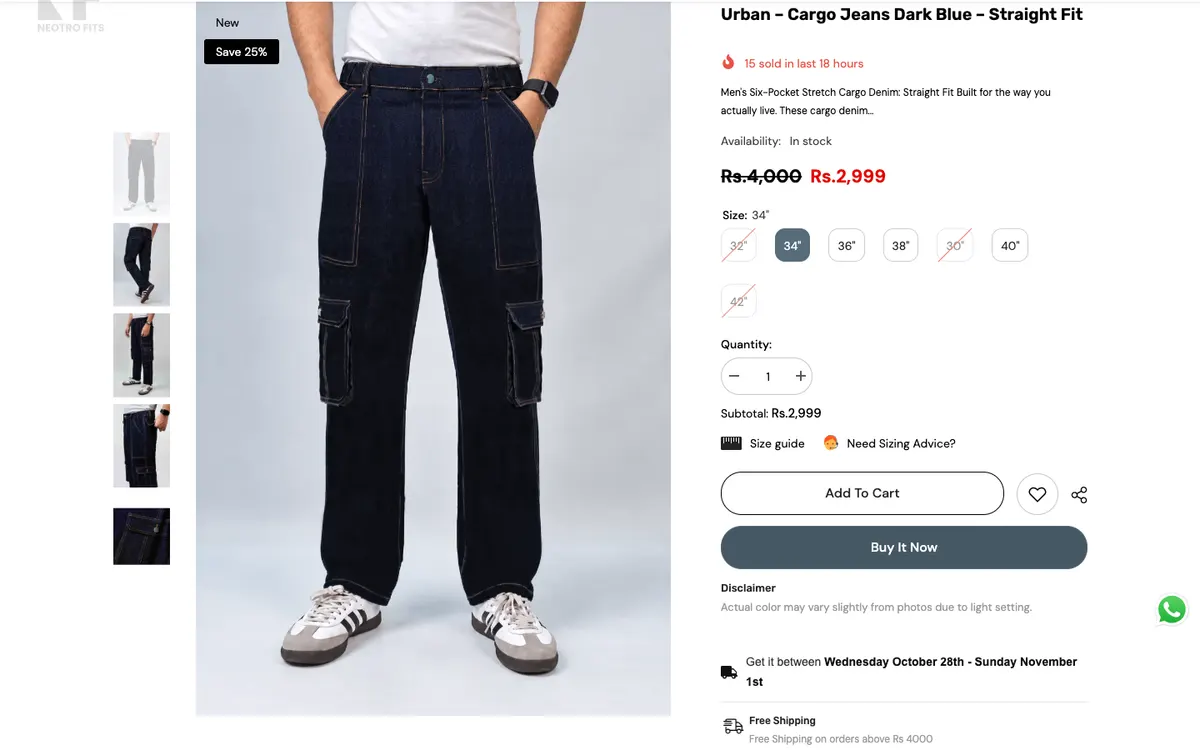 Neotro Fits: size picker, size guide, Buy It Now
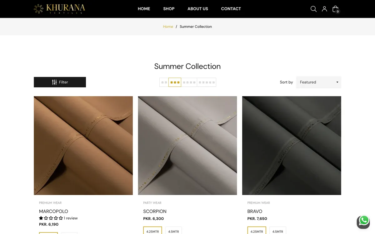 Khurana Textiles: swatches on product cards
Photos that show the product properly
Use several clear images: the product on its own, in use, and close up on the details that matter. Keep lighting and backgrounds consistent across the catalogue so the store looks like one brand. Compress images so the page still loads quickly, since a slow page loses people before they see the photos.
- A clean main image on a plain background.
- At least one image showing the product in use or on a person.
- A close-up of texture, stitching, finish or other details buyers worry about.
- A size or scale reference where it helps, such as a dimensions image.
A title and description that help
Say what the product is in plain words, then list the details a buyer needs: materials, dimensions, what is included, and how to care for it. Short sections and bullet points are easier to scan than one long paragraph. Avoid claims you cannot back up.
The product page checklist
- 1Clear photos
Several angles, consistent style, fast loading.
- 2Honest details
Materials, size, what is included, care.
- 3Easy sizing or options
Variants that are obvious, with a size guide where needed.
- 4Price and delivery
Visible before checkout, with no surprises.
- 5Returns and exchange
Stated simply near the buy button.
- 6A clear buy button
One main action that stands out on mobile.
Make options and sizes obvious
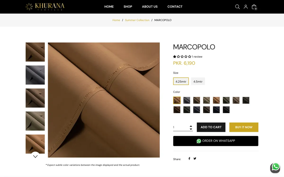
If a product comes in sizes or colours, show them as clear choices and mark what is sold out instead of hiding it. A size guide next to the picker removes one of the most common reasons people hesitate on clothing. For fabric and similar products, showing the available lengths or colour swatches directly on the product card saves a click and a doubt.
Answer the delivery and returns questions early
People worry about shipping cost, delivery time and what happens if the product does not fit. Put short, plain answers close to the buy button and link to the full policy for those who want it. Hiding these until checkout tends to cause abandoned carts.
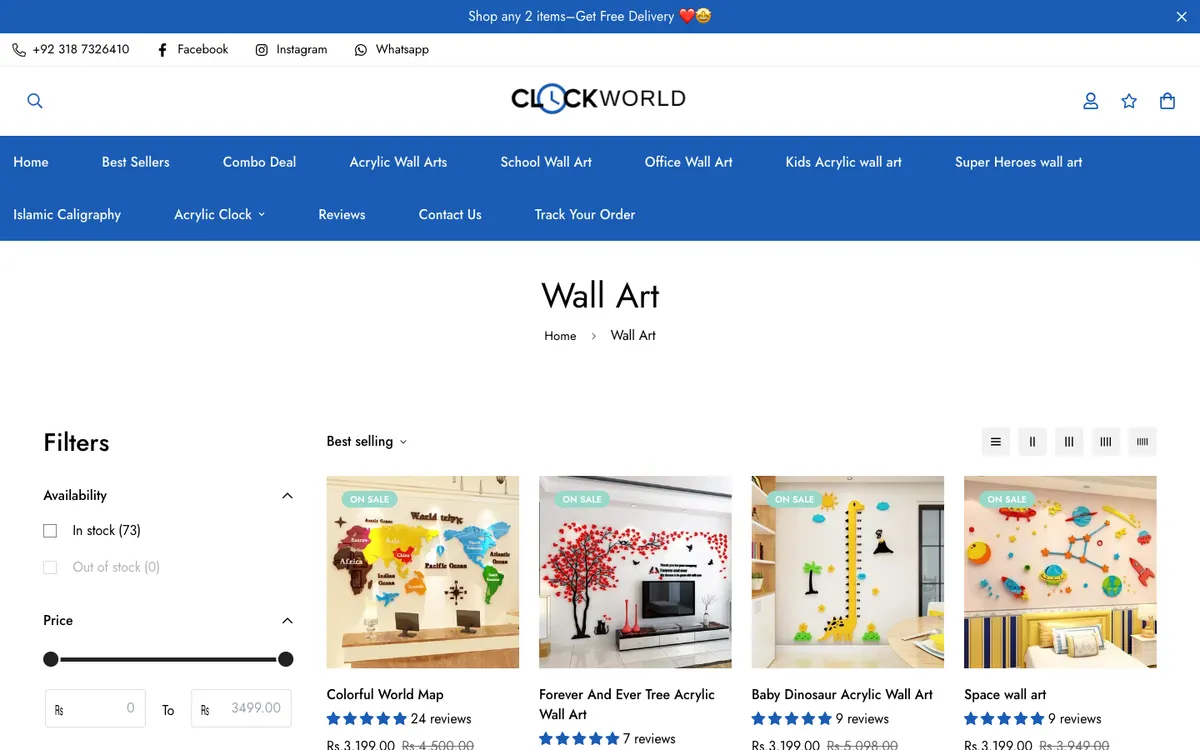
Reassurance works best when it is specific. A store that sells in markets where cash on delivery is common, for example, does well to say so plainly. ClockWorld repeats free-delivery and cash-on-delivery reassurance throughout its pages for exactly this reason.
Build trust without clutter
Real customer reviews, clear contact details and recognised payment options all help. Add them where they are useful, not everywhere. A calm, uncluttered page feels more trustworthy than one packed with badges. Avoid fake countdown timers and invented stock warnings, because shoppers notice and it costs trust.
Help people find the right product
Product pages work better when the catalogue around them is easy to browse. Filters that match how people think, such as skin concern, nib grade or fabric type, are more useful than generic categories. Stores with large catalogues, like Branded Cut Pieces and Al Qalam, rely on tags, brand navigation and technical filters to keep choices manageable.
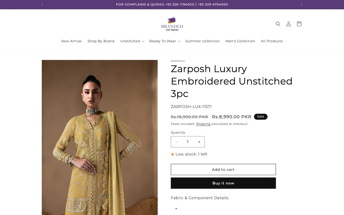 Branded Cut Pieces: brand carousel and tags
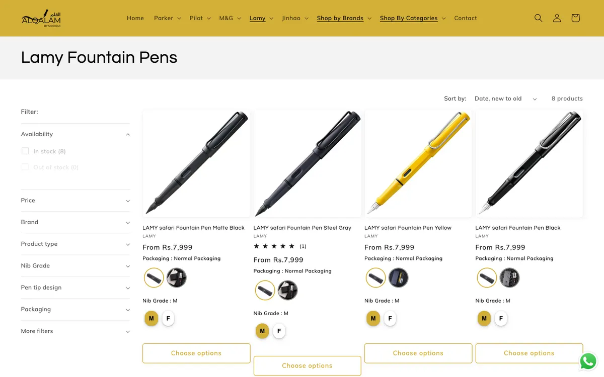 Al Qalam: technical filters
Check it on a phone first
Most store visits happen on mobile, so the buy button, the options and the photos need to work on a small screen. Test the whole path from the product page to the order on a real phone before you launch.
 Neotro Fits
 Khurana Textiles
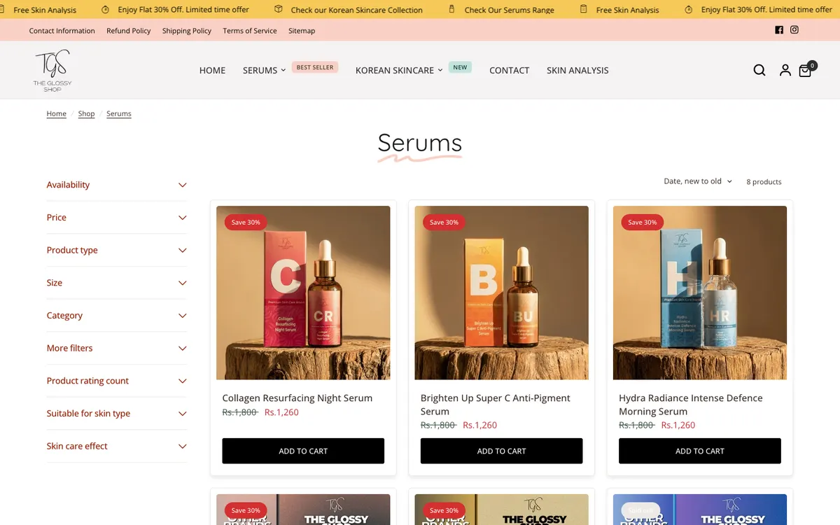
 The Glossy Shop
Write descriptions that sell without exaggerating
A good description answers the question "Is this right for me?" in as few words as it needs. Start with who the product is for, then the details that matter, then what to expect when it arrives. Plain, specific wording beats big promises.
A simple structure that works
- One or two sentences on what the product is and who it suits.
- A short list of key features or specifications.
- Materials, size, fit or dimensions, with a guide where relevant.
- How to use or care for it.
- What is included in the box and what is not.
Pricing, discounts and honesty
Show the real price clearly, and show any delivery cost before the checkout stage. If you run sales, display the old price and the new one, and make sure the old price was a real price. Shoppers compare quickly, and an honest, simple price builds more trust than a confusing one.
Reviews and social proof
Genuine reviews help undecided shoppers more than almost anything you write yourself. Make it easy for real customers to leave one, show them near the product, and reply to negative ones calmly. Never invent reviews or counts. A store with a few real reviews is more convincing than one with many obviously fake ones.
Page speed on a store
Product pages are image-heavy, so speed needs attention. Compress product photos, avoid loading every app on every page, and check how the page behaves on a mid-range phone. A slow product page loses sales before the shopper reads anything. Many of the fixes in the guide to slow WordPress sites apply to stores too, especially around images and scripts.
Frequently asked questions
How many product photos do I need?
Enough to answer the shopper's questions. For most products that means four to six: a main image, a lifestyle image, a close-up of details and a scale or size reference.
Should I show out-of-stock sizes?
Usually yes, clearly marked. It shows the shopper that the product exists in their size and may return, and it avoids the frustration of choosing something unavailable at the last step.
Do I need a size guide?
For clothing and footwear, yes. A clear size guide is one of the simplest ways to reduce uncertainty and returns.
Is Buy It Now a good idea?
It can help shoppers who already know what they want, as long as the normal add-to-cart path stays available for those who want to keep browsing.
Can the product page be improved without a redesign?
Often, yes. Reordering information, improving photos, adding a size guide and moving delivery details closer to the button are small changes that make a visible difference.
A final pre-launch pass
- Order a product yourself, from the product page to the confirmation email.
- Check every size and colour option actually selects the right variant.
- Read the delivery and returns text as if you were a new customer.
- Test the page on one iPhone, one Android phone and a laptop.
- Look at the page speed, since heavy images are the usual culprit.
Setting up or improving a store
Store setup, theme customisation and migrations are covered in the Shopify development packages. For a full store example, read the Silky Bouquets case study and how to design for made-to-order products. If you already have a store and want its product pages reviewed, send me a message.